Reviewing This Month's Theme
For August, our theme was 'Social Awareness'. We challenged the community to create visualizations that covered topics that the author thinks should have a higher degree of attention focused on them - beyond typical social issues, this could also include health, financial and other focuses. The featured authors in this post submit their viz and commentary for your enjoyment.
Morag Munro
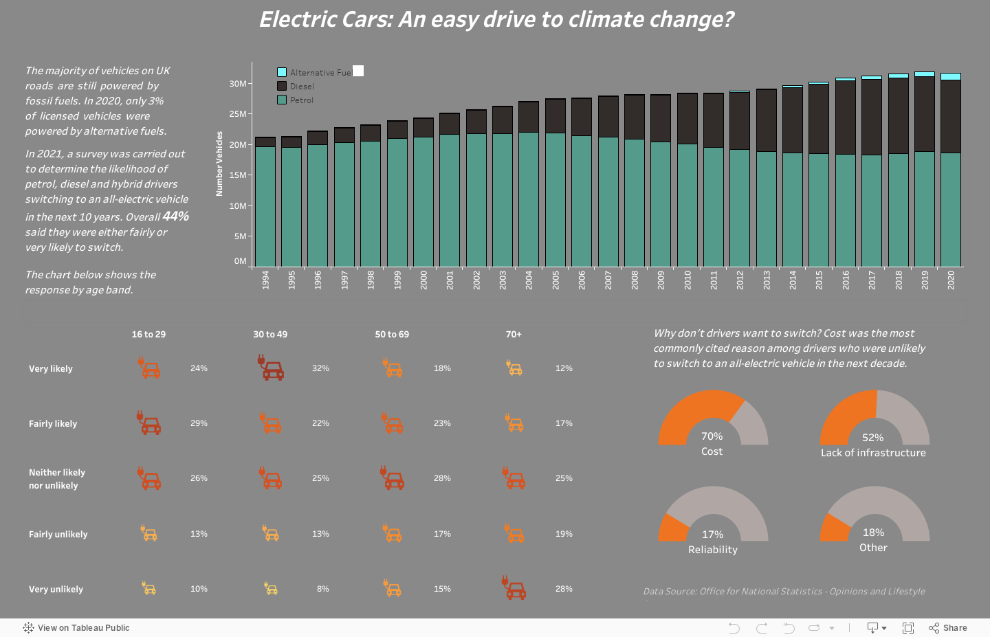
Climate change and how the world is addressing it has become an increasingly important topic in recent years. As of 2019, transport was responsible for 27% of total UK greenhouse gas emissions and the government have pledged to achieve net zero emissions by 2050.
One of the ways they plan to do this is by phasing out the sale of new vehicles reliant solely on fossil fuels by 2030. However progress has been slow and the government may need to do more to remove the barriers that prevent drivers switching to an all-electric vehicle.
In 2021, a survey was carried out by the Opinions and Lifestyle Survey (OPN), looking at the views of adults in Great Britain and the results were published by the Office for National Statistics shortly afterwards.
Billy Flannery
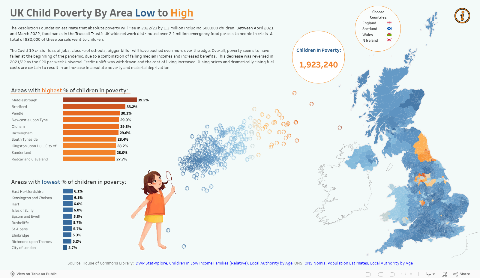
When the theme was announced as a viz for social good, my thoughts immediately went to the cost of living crisis here in the UK. Costs of petrol, food, housing and energy have risen so dramatically in recent months that it's making life for small to medium income families not only more difficult, but is also forcing many into poverty. There are an increasing number of families now having to visit food banks and children are Going to school hungry, missing out on activities and will likely suffer long term effects as a result.
The UK government website holds very good data on all constituency areas and had a suitable dataset for this purpose. With this viz, I wanted to show the regions of the UK that are most effected and also to be able to look at each country within the UK individually.
I approached this with the idea of not only highlighting the information, but wanted to also make sure that there was a visual cue to keep underprivileged children in the mind of the reader. I decided including a scatter plot showing % of population and total number of children in the style of a child blowing bubbles should do this (and scatterplots always remind me of blowing bubbles ).
Stewart McAbney
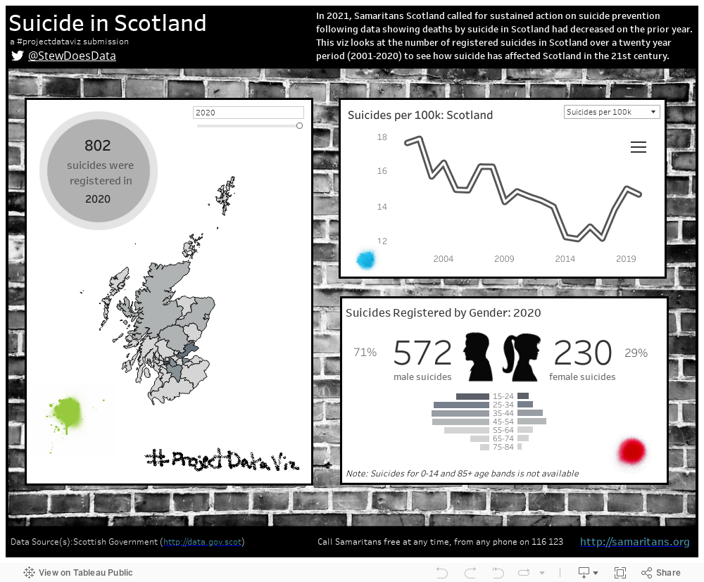
With the brief of social good I knew I wanted to focus on something that mattered to Scotland and, browsing through available data I happened across a number of suicide statistics that I knew could make for interesting visuals. But, with the subject matter, I felt it would need a sombre tone, and so decided to try and make it monochrome.
The viz itself looks at suicides by council area or gender and age band, and the cases are given as actuals but also per 100k in order to ensure some level of compatibility given the disparate populations of each authority. The option to look at council area and gender together was sadly not available, but have been provided separately.
The brickwork background represents the idea of a dead end (ie hitting a metaphorical brick wall) and extending this idea it made sense make the charts look like posters. Even when going for a sobering look and feel, I felt the addition of a few pops of colour offered some optimism, so I took a 'spraycan' to the wall as it's better to express oneself than keep things bottled away.
Simon Chung
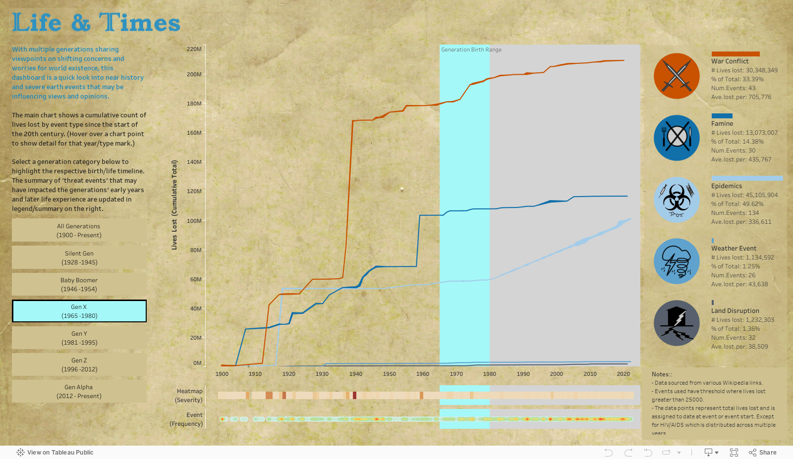
Social media today encourages people to voice their opinions, however in these platforms there is so much content that it seems that less is being heard and possibly even less of an understanding especially between generational views.
This dashboard pushes social awareness aspect by considering “near history” from a generational perspective, focusing on major earth events (catastrophic events outside of control of the individual) that have been classed into broad groups “war conflict, famine, epidemics/disease, weather events and land disruption” that may have an influence on a particular age group.
Obtaining the data was the most time consuming prep activity, sourcing from various Wikipedia pages and so it is by no means perfect or complete. However I hope this is suitable for initiating social awareness which should encourage further investigation where required.
The dashboard is simple with a single chart being the main focus, but allowing interaction through generation group selectors. Tooltip table detail from the chart data points is a useful feature to add detail without cluttering the main display. The interaction framework is enabled using parameters and parameter actions to drive reference band settings and dynamic filters are applied to the legend summary text.
The dashboard uses a historical parchment document theme, simple and muted tones hopefully conveys respect for the subject matter. The dashboard will hopefully initiate some thoughts, discussions and consideration for generational awareness.
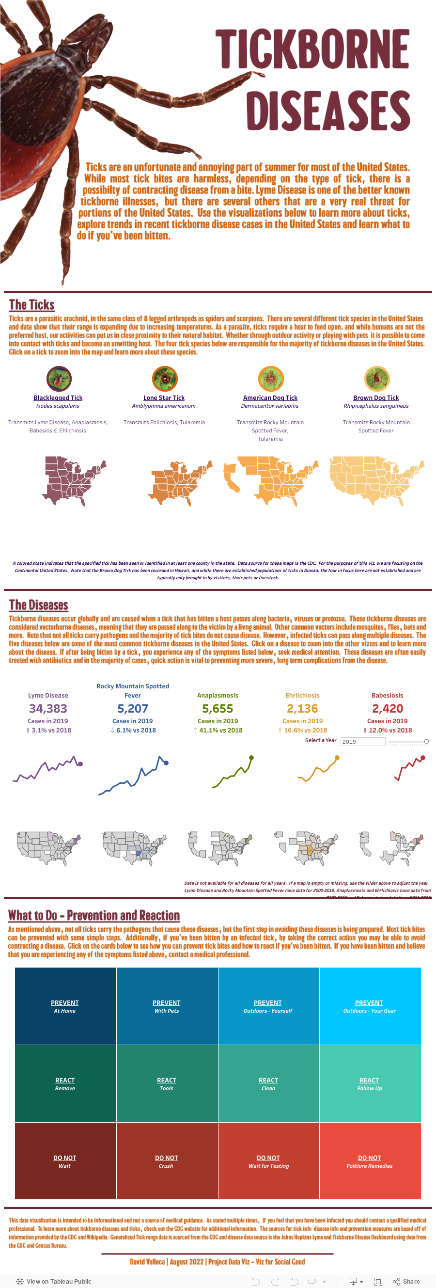
David Velleca
When we decided to do Viz for Social Good for the August theme, I immediately knew that I wanted to do a viz about ticks. I know it's not the flashiest subject, but lately, I've been hearing a LOT of misinformation in the media and conversation about tickborne illnesses. Inflated figures on the number of infections, misdirection on how to respond, and incorrect information about the prognosis. When people are informed they are better able to react and respond, and how better to educate and inform than with data?
For my viz, I knew that I wanted to create an interactive dashboard in the infographic style that looked at the individual ticks and their range (let people know what to be worried about where), infection rates (reset the understanding of how quickly the number of annual cases is increasing), infections by locale (know if people really need to worry) and how to prevent and react should you be bitten by any tick (put minds at ease with simple steps to prevent bites and infection).
In addition to interactivity, I wanted the dashboard to leverage Tableau's animations and change the layout of individual charts with each interaction. To accomplish this, I used a combination of parameter actions, floating containers and Tableau's animations. To polish the viz, I created graphics in Adobe Illustrator.