Reviewing This Month's Theme
For January, our theme was Piracy We challenged the community to create visualizations with a provided data set that covered the reported acts of piracy from 2000 to 2022. Let's take a look at some of those vizzes!
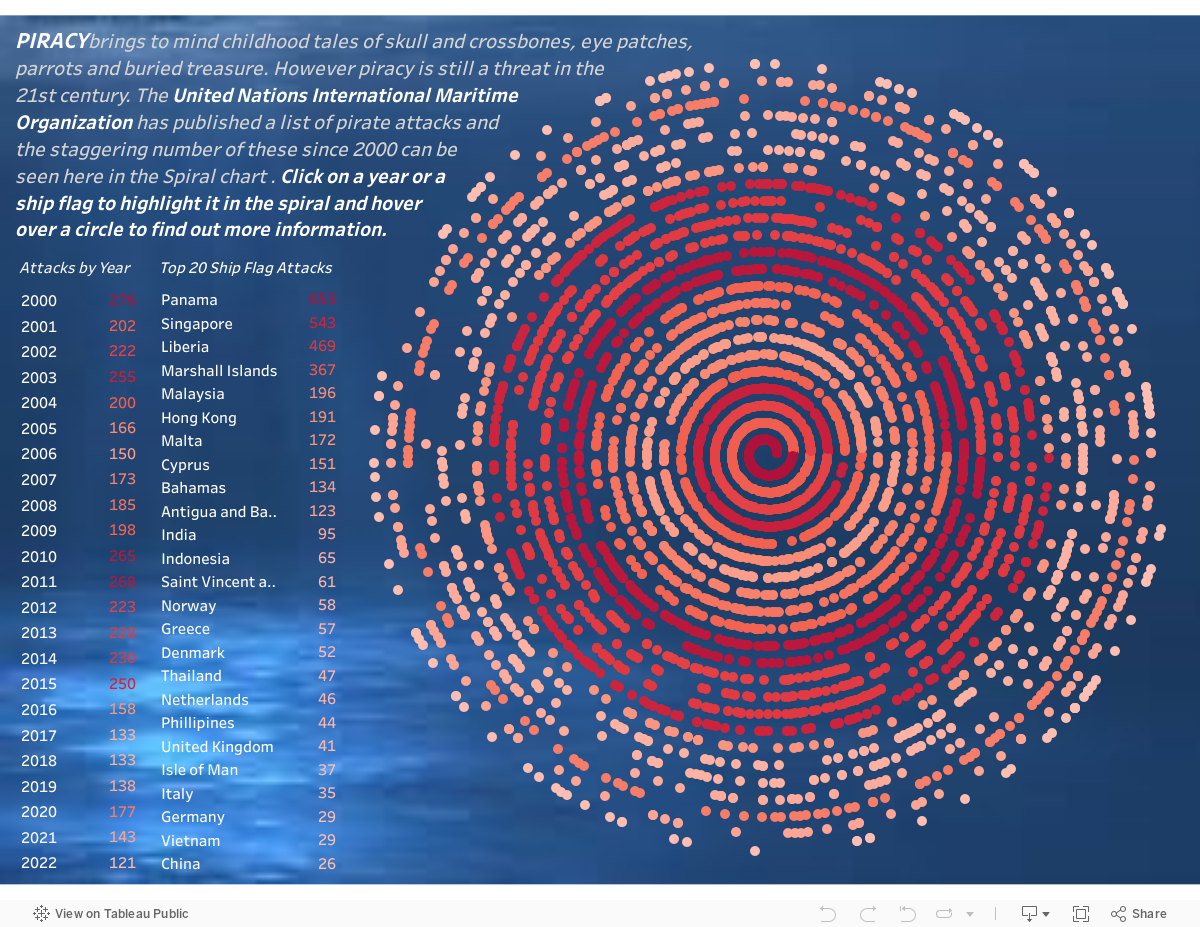
Morag Munro
My initial idea for the piracy data was to use a map view to show where attacks took place however it soon became clear that the longitude / latitude columns in the data set were not accurately populated. I decided instead to look at the frequency of attacks over the twenty three year period and I chose a spiral chart to illustrate this.
Spiral charts are handy for showing a long time period without taking up as much space as a line or bar chart. I also thought that my spiral chart reminded me a little of a whirlpool which fits well with the topic.
I used the red colour pallette to emphasise the years where attacks were higher and also made use of Tableau’s highlight action to hone in on a specific year or ship’s flag. Since the data contains a fair amount of detail for each attack, I made use of that to create a user friendly tooltip that gave more background to each incident. Adding an underwater image to the background gave the finishing touch.
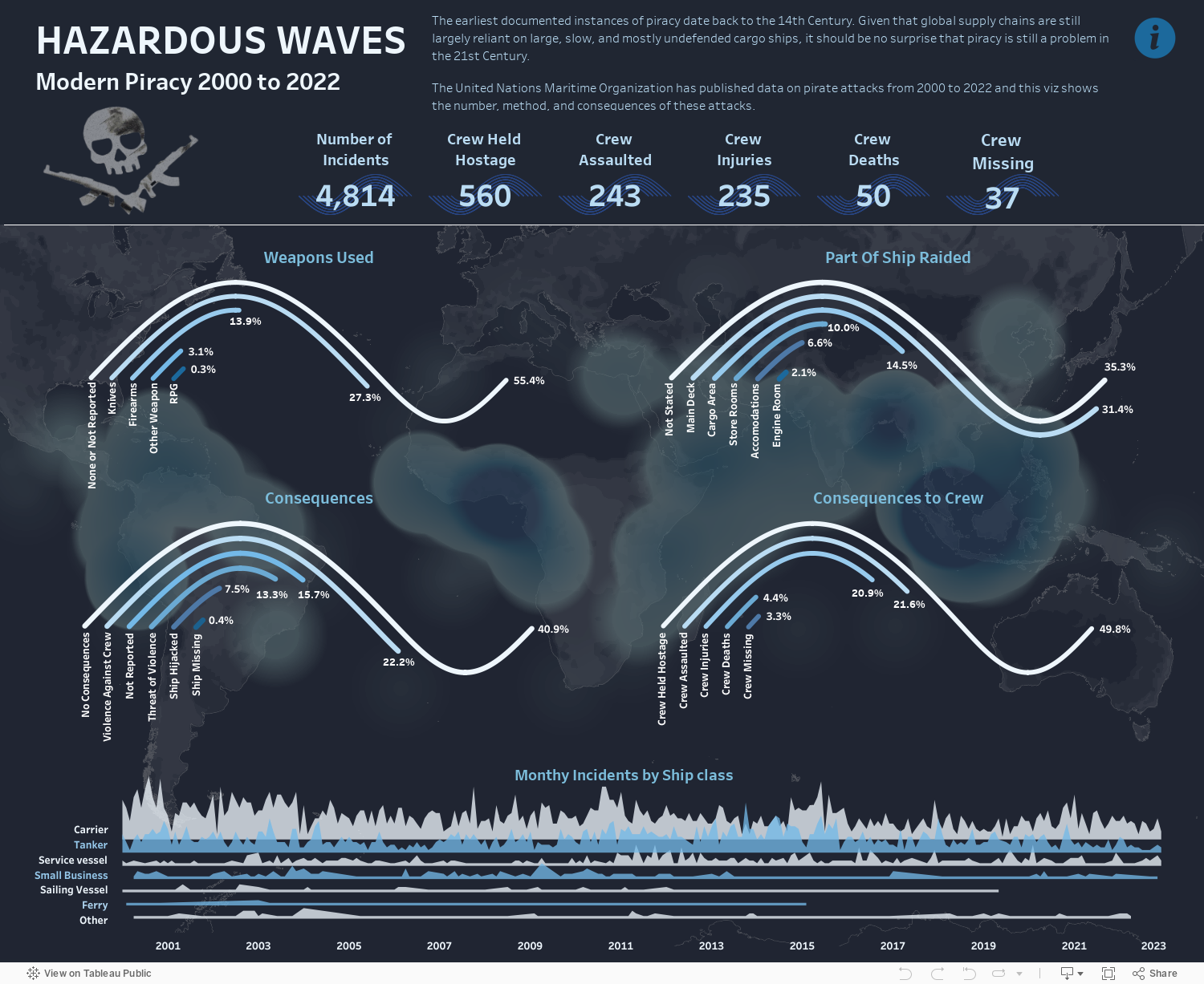
Billy Flannery
On reading this months theme my thoughts immediately went to sailing ships, cannons and eye-patched buccaneers. Modern piracy may be far removed from these images, but is still very much alive today and as long as there are ships travelling trade routes laden with goods there will still be opportunistic criminals looking to take advantage.
I wanted to go with a nautical theme and I remembered an impressive wave chart from Vamshi Krishna I happened across on Tableau public that I thought I could adapt to suit. Found here.
For the wave charts I decided to show 4 categories: weapons used, part of ship raided, consequences and crew consequences with each wave showing the percentage of incidents within each category descending, which did have a nice wave effect. I originally wanted to make this interactive with a filter on ship types and year, but with this type of chart I found that the marks can overlap the lines and become lost, so this had to remain static and I even had to manually fix some of the marks to make it work.
Because I was unable to show incidents by year and ship type in my original method, I decided to incorporate a joy plot showing this instead at the bottom of the viz which also added to the overall wave theme.
I wanted to highlight the parts of the world where piracy is most common, but the dataset was missing Latitude and Longitude data for a large amount of the incidents, and some were even in the middle of a continent! I decided to clean up some of the obvious errors (thank you international Maritime Bureau) and use a density map to show location data (where available). This was placed as a background to the main charts just as an indicator of the areas where world piracy is prevalent.
Finally I wanted to include some BANs showing the consequences to crew which acts as a stark reminder that piracy is not just a thing of the past and can still have dangerous and deadly consequences today.
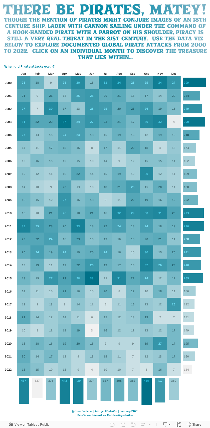
David Velleca
I bounced between several different ideas before landing on a simple heatmap, with bars to summarize total attacks by month and year. But that's not all! Taking some inspiration from the subject matter, I decided to bury some treasure in the viz and use the new-ish dynamic zone visibility to hide that treasure. Really, it's a simple click parameter action that drives the dynamic zone visibility by setting the target parameter to either a selected month & date combo or resetting it to "none" to return to the main view. The "treasure" view simply contains some additional detail for the selected timeframe.
Thanks!
Stay tuned for more January vizzes, and thanks for checking out this post! Be sure to join us for February's Challenge!