Reviewing This Month's Theme
For November, our theme is 'Land Use by Crop Type - What's Growing Where?.' We challenged the community to create visualizations with a provided data set that covered the different crops grown in 200+ countries from 1961 to 2020. Let's take a look at some of those vizzes!
Morag Munro
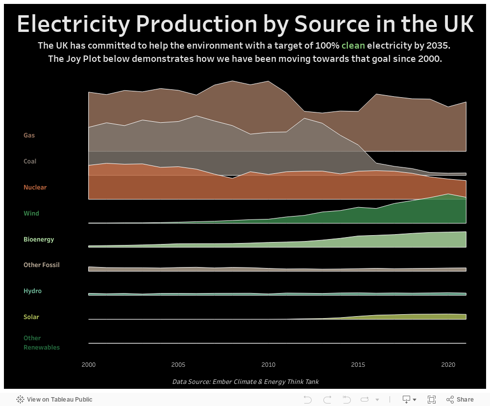
This month's topic is an important one globally but I chose to focus on data for the UK only. Initially I was trying to think of something more interesting than a line or area chart with a filter for country. That's when I remembered about Joy plots which are overlapping area charts. These can be useful if you have a number of area charts that make the visualisation vertically rather long. Using joy plots condenses the visualisation and make it easier to see overall trends at a glance. However they do have limitations and I soon discovered that it would not work for every country in the data set. So I decided to use only the UK data and set about creating my own joy plot.
I had to choose the order and spacing of my dimensions carefully so that I could keep the chart as small as possible vertically while making sure that the top of each area chart was not hidden. Colour was also an important consideration because I wanted a different colour for each dimension so had to find nine colours that went well together. The result is a simple viz that makes it easy to see the trends in the data over the 22 years.
Billy Flannery
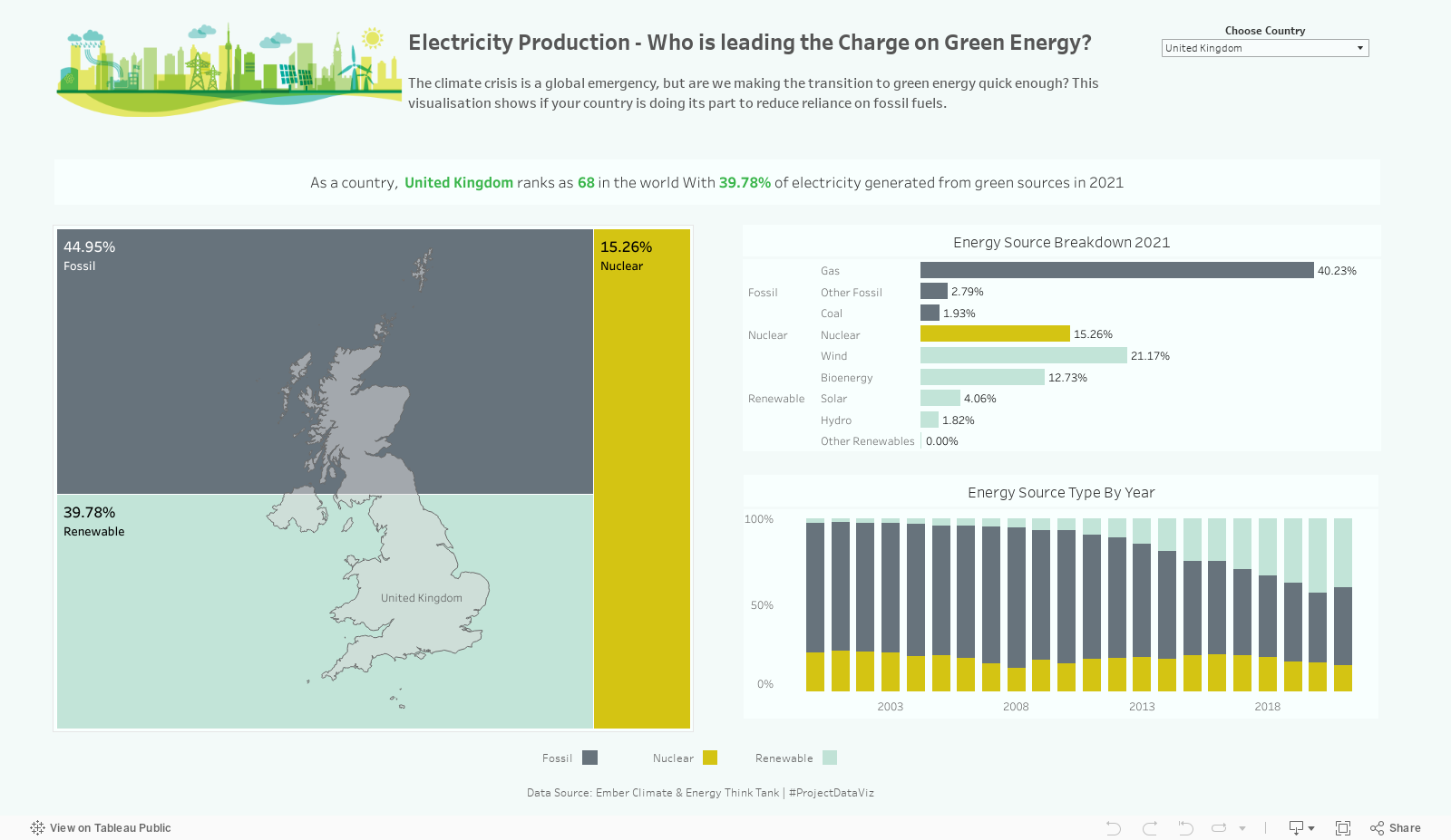
This month's topic is looking at electricity generation by country and source. With a global climate emergency that effects all of us, I wanted to make sure that anyone could use this viz to find out where their specific country ranks on production of green energy and the progress made in the last 20 years with regards to transitioning.
I opted for a tree map to visualise the three specific types of electricity production (Fossil, Nuclear and renewable) with a bar chart showing a breakdown of each specific source as this gives insight into where exactly our energy comes from.
To visualise the trend over the last 20 years, I used another bar chart showing overall percentage of each energy type per year which could be used to clearly see the growth/reduction of energy types over the period.
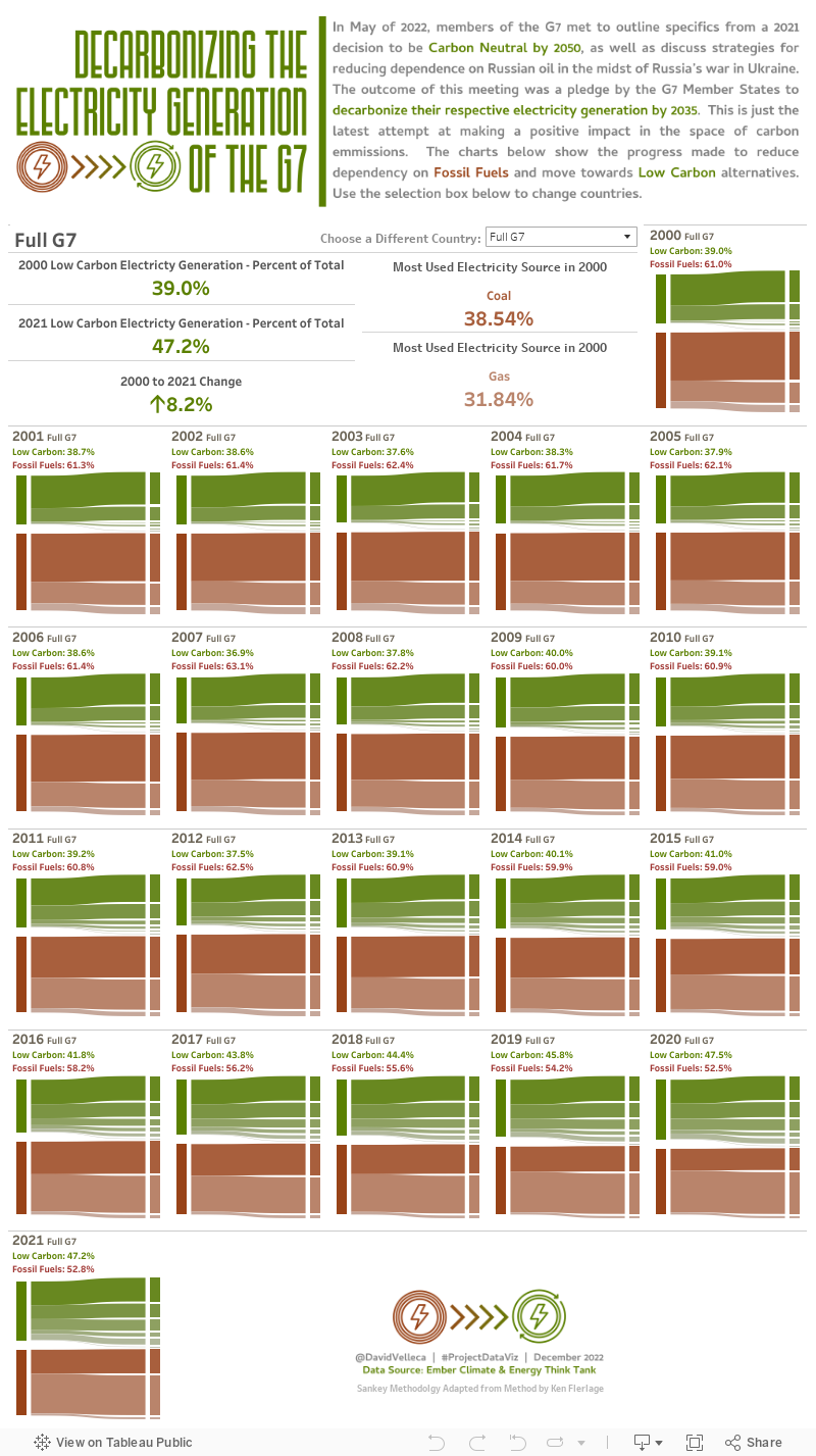
David Velleca
Thanks!
Stay tuned for more December vizzes, but thanks for checking out this post! Be sure to join us for November's Challenge!