Reviewing This Month's Theme
For November, our theme is 'Land Use by Crop Type - What's Growing Where?.' We challenged the community to create visualizations with a provided data set that covered the different crops grown in 200+ countries from 1961 to 2020. Let's take a look at some of those vizzes!
David Velleca
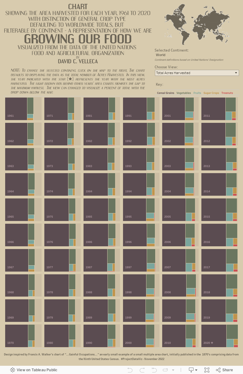
For this month's data, I knew almost immediately that I wanted to use a treemap. Not because I really like them as a visualization type (I don't necessarily), but because they provide a bit of a skeuomorphic flavor. When I think of crops growing, I instantly think about to driving past rows and rows of green leafy soybeans, golden corn stalks awaiting harvest or white fields of cotton. The next thing I think of is flying over the so called "flyover states" and being amazed by the patchwork land that is made up of the modern farm's different crops. In short, a treemap is a great way to get that same effect while incorporating some nice coloration.
Once I had my base visualization figured out, I needed to figure out how to incorporate a data story to go along with the (hopefully) pretty viz. This data source lends itself nicely to looking at changes over more than a half century of crop growth. With this in mind, I really only had a few options if I wanted to stick with my treemap. I could have animated across the different years, but while that may have been an interesting animation, it would be nearly impossibly to compare non-consecutive years to one another. The other option was small multiples, a way that I could display all of the years in one dashboard allowing users to easily compare the 60 years with one another. With my viz type and data story figured out, it was time to get building.
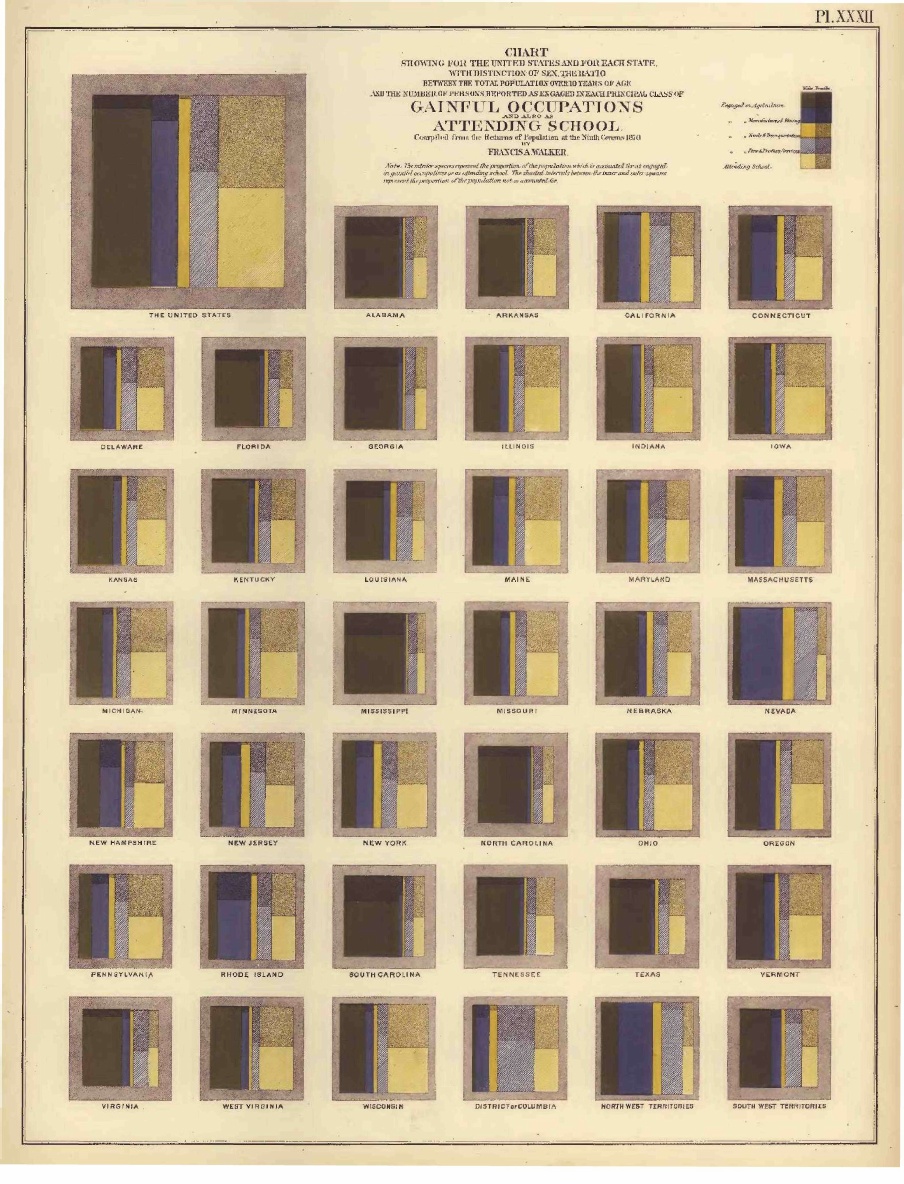
I put together a simple tree map, then went straight to Google and searched "Flerlage Twins Small Multiples" to find my go to method for creating any small multiple grid (check it out!). You know it's good when it's cached in your Chrome search history! Speaking of history, I was curious how long small multiples have been around in the data visualization world, so I did another Google search and ended up on Wikipedia. Small multiples have been around for about 150 years, with the first known (at least to Wikipedia) example being by Francis Walker. Interestingly enough, that example (seen below) was a treemap small multiple. I think the viz is really quite beautiful, and decided to use it as my inspiration for my final product.
I really liked the darker color palette and decided to leverage something similar for my viz. With the treemaps created, I created some calculated fields that controlled how my labels behaved - I wanted to include the Year, and also indicate which year had the largest number of acres harvested with a small star. I also only wanted the labels to appear once, on the largest piece of the treemap. A couple calcs later and I was squared away. Next up was a bit of interactivity.
What would be the point of having this great dataset with country level detail in it without giving some way to get a bit deeper. Well, since the time period in the data spanned loads of geopolitical change (especially the breakup of the Soviet Union), I decided to drilling into countries that no longer have boundaries on the map may be a bit tricky. Instead, I grouped countries by continent using the UN's designation and mapped them. With a few simple calcs, the map then becomes the control for a parameter action that allows the user to select a continent. I also added a mechanism to switch from the total acres harvested to percent of total land harvested for each year. When the viz opens, it defaults to total acreage, and behind each treemap that has fewer acres harvested than the max, a light brown "ghost" box behind the viz indicates the max acres harvested to make comparison easy for the user.
Add in a few calcs to clean up my tooltips, and that's this viz. I'm really happy with how it turned out, but definitely open to feedback!
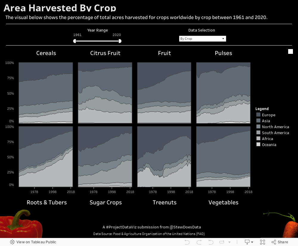
Stewart McAbney
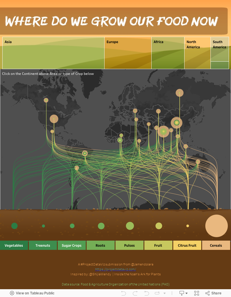
Jonathan Amendolara
Thanks!
Stay tuned for more November vizzes, but thanks for checking out this post! Be sure to join us for November's Challenge!