Reviewing This Month's Theme
For September, our theme was 'Mastering Line Charts'. We challenged the community to create visualizations that used a line chart as the primary element. The goal was to create a well thought out viz that employed generally accepted best practices for line charts. Let's dig into some of the vizzes.
David Velleca
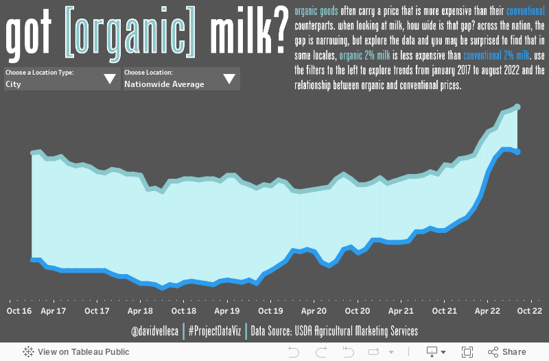
For this challenge, I really wanted to create a line chart that told a meaningful data story in a clean, minimalist package. For my data, I decided to take a look at market prices for milk. I initially decided to take this route due to the inflation that most people are feeling right now. However, when exploring the data, I decided instead to look at the relationship between the prices of organic and conventionally produced milk. There is a conception that buying organic means paying a premium. When looking at the data, I saw that this isn't always the case (check out Seattle, WA in the viz below).
So, for my minimalist approach, I did the following:
- Eliminated all grid lines and borders,
- Leveraged the text intro to my chart to serve as the color legend, highlighting the key dimensions in the same color as the chart,
- Crafted my tooltips in a manner in which they read like a sentence,
- Since the relationship between the two types of milk was more important than the price value (at least for the story I am trying to tell), I eliminated the vertical axis and just included the values in the tooltip,
- I added supplemental detail in the tooltip (specifically the value of the price gap)
I decided to fill the 'gap' between the lines with a polygon that changes color depending on which type of milk (conventional or organic) is more expensive at that point in time. Note that the polygon is really just for a bit of visual interest and a chance for me to try something different. It could definitely be removed without impacting the overall data story. To create this, I leveraged a technique shared by the DataSchoolUK.
Interactivity is a key point in my visualizations. So to make this just a bit more interesting, as well as providing an interactive way to explore the data, I created worksheets that act as dynamic filters leveraging parameter actions and show/hide buttons. That's it. A relatively quick and fun viz!
Stewart McAbney
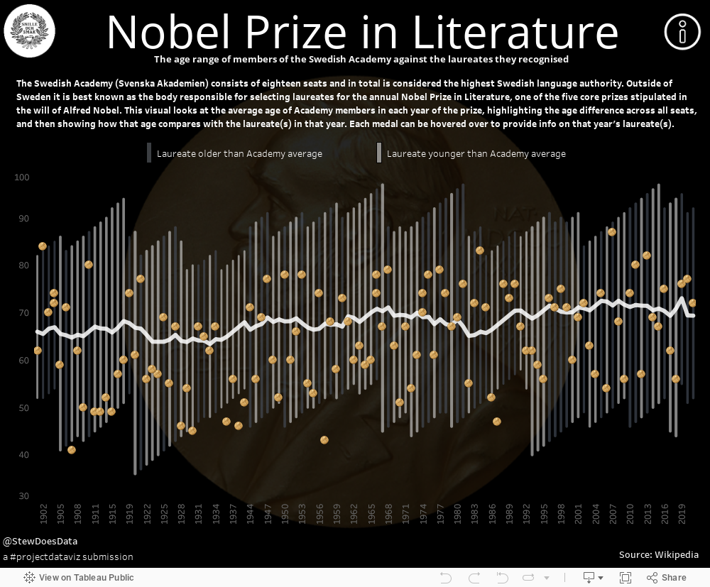
The Nobel Prize in Literature is a constant interest and its always fun to try and predict who, in October, will be announced as the latest laureate. Rarely are predictions on the money. But when forming guesses, speculation tends to look at traits of past winners, like sex, language, or nationality as a way of eliminating potential winners.
To this end I wondered if anything new could be gleaned from looking at the average age of those deciding upon the award. Do they tend to favour their contemporaries? Do they reward their seniors? Or are they championing be the new wave of writers?
While the result was inconclusive, the challenge of using the humble line chart to express data and see how it could be stretched to convey as much information as possible was interesting. In the end, the result is actually two line charts overlayed for an effective display: a dual axis showing average ages and a single line, switched to a shape, that plots the medals.
Morag Munro
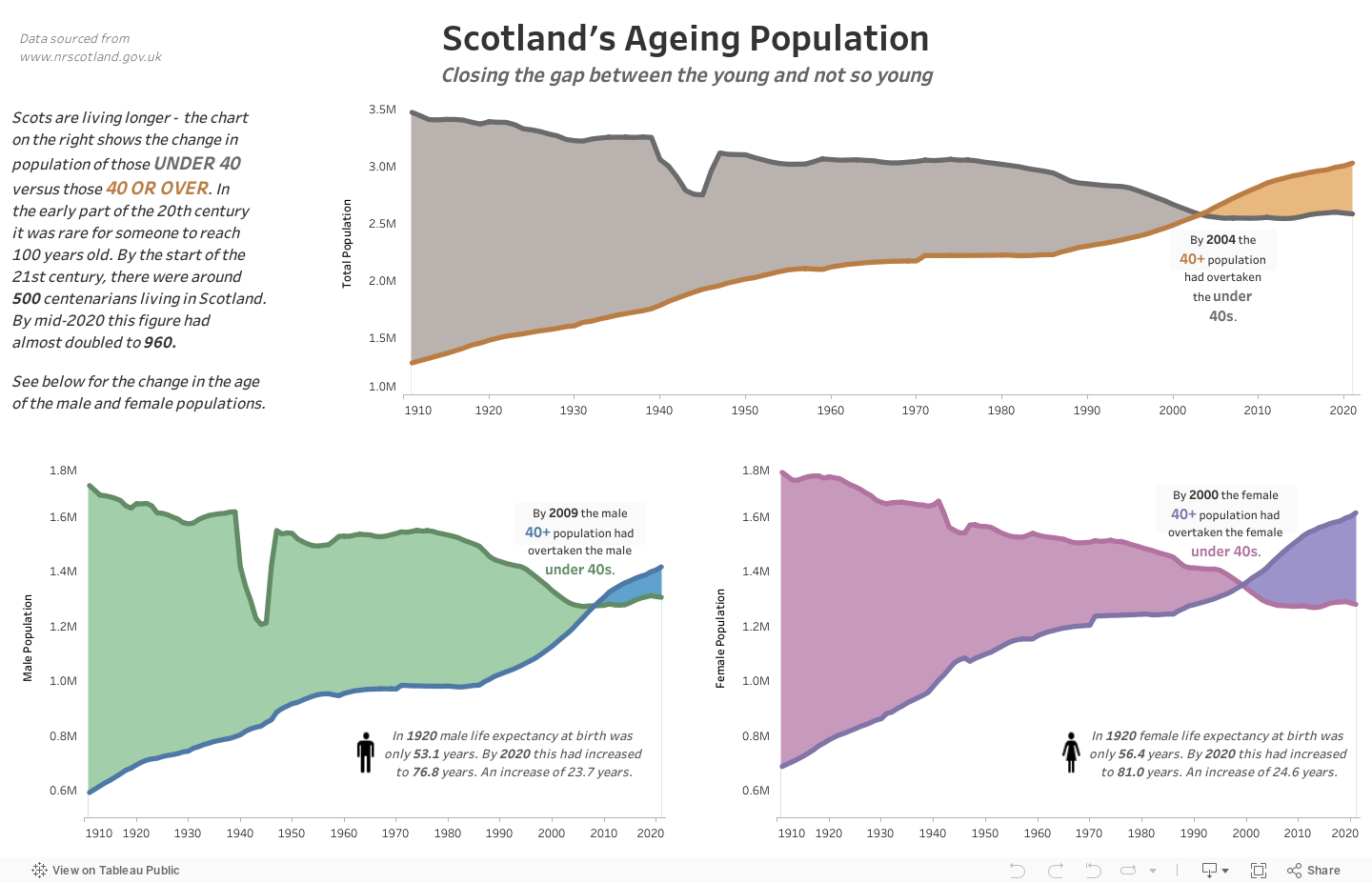
While browsing the web for ideas, I came across Andy Kriebel’s line chart on America’s Aging Population, which was used for both Makeover Monday and Workout Wednesday. This gave me the idea to look at Scotland’s Ageing Population (note the change to British spelling!) I decided to try out the technique of shading the area between two lines and found a really clear explanation of how to do this by Timothy Manning at this link.
I chose to split the population by those under forty versus those over forty so that the lines would cross. It’s only in the last twenty years or so that the over forty population has overtaken the under forties. However it is interesting to see the change in the age of the population over the last hundred years and how much life expectancy has increased in that time. In 1932, Walter B. Pitkin wrote his popular book “Life begins at Forty”. The title has become a well-known phrase often quoted to people approaching their fortieth birthday. Surely it is more true now than ever before.
Simon Chung
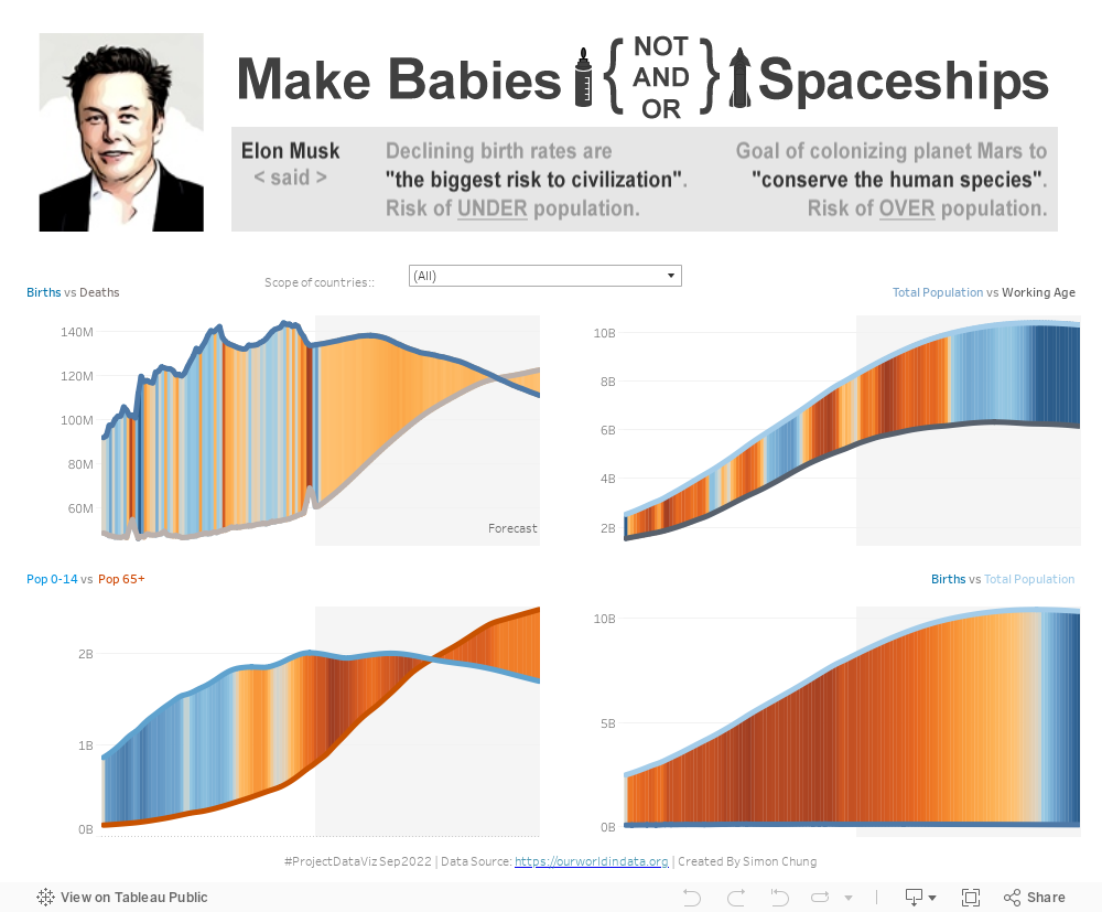
Elon Musk is never out of the headlines, but there are two of his opinions/objectives that I wanted to cover in this months ProjectDataViz challenge. SpaceX is one of Elon's companies where one of the primary objectives is to build an interplanetary craft capability with the aim of colonizing Mars to conserve the human species due to limited resources on earth. More recently he expressed that he is worried about the risks associated with the decline in birth rates, in that same podcast he insisted that the audience check this out for themselves.
So, here it is, in this viz challenge I set out with the intention of exploring and/or debunking Elon's views using population statistics as a very high level indicator of whether we should have concern in either of these viewpoints.
The quad charts show pairs of population metrics displayed as lines to show basic trends for potential under/over population and general ageing trends. The lines are supplemented with vertical lines (barbell method) between the metrics and coloured to show year on year net change as a gradient.
The objective of leveraging the lines with colour gradient worked out well as a technique, and while I do think supports the argument for making more babies, the question of overpopulation requires more metrics to explore further. One thing for sure is that line charts with Tableau can be as simple or conceptual as you want to help tell that story. The other point here is that someone who created an EV company and has a company that is pioneering resuable vertical landing booster rockets is probably worth listening to.
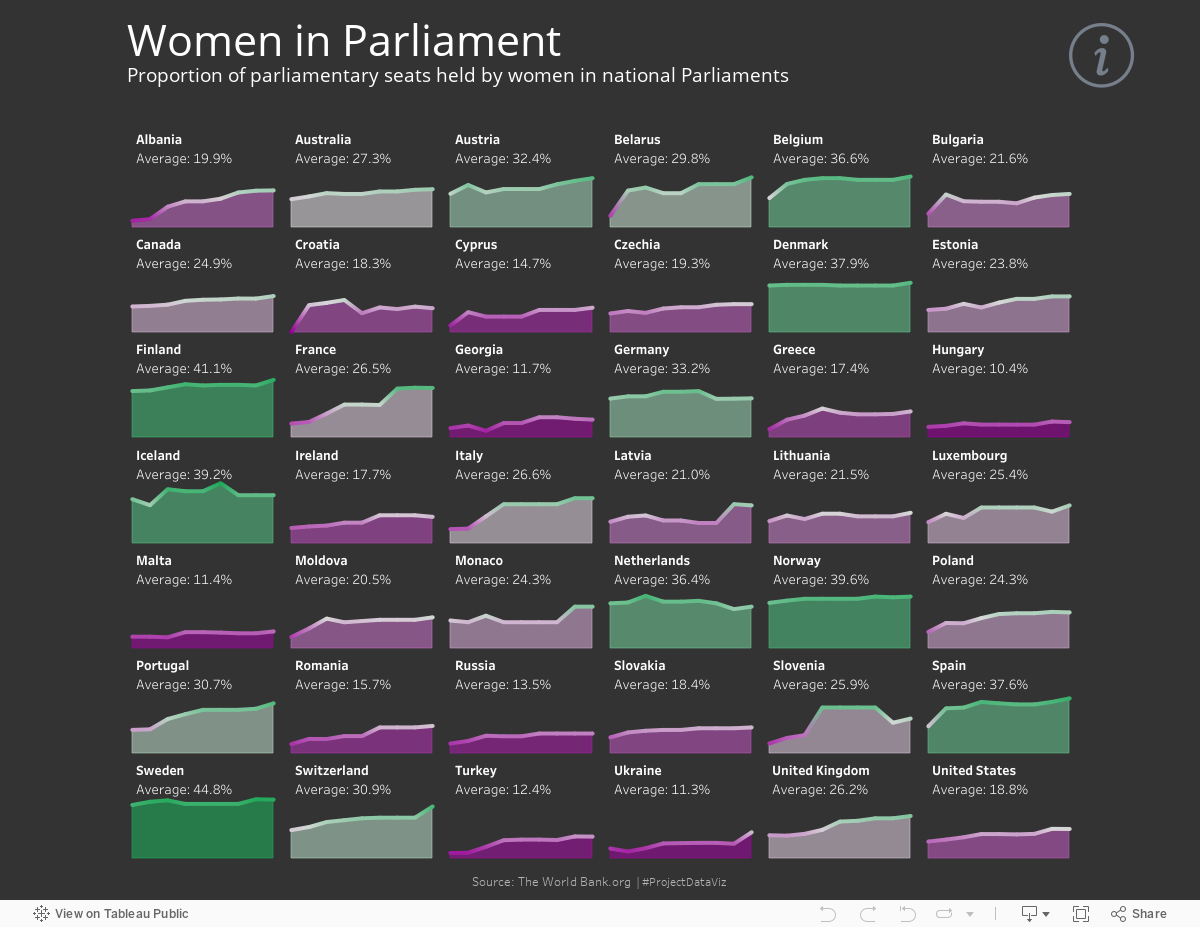
Billy Flannery
In Scotland women now represent 45% of our 129 Parliamentarians which is a record high since it’s reopening in 1999. We are moving closer to gender parity, but is this the case elsewhere? And if so, where?
I found a dataset from TheWorldBank.org showing women in parliament seats by country from 2000 to 2020 which has some interesting numbers.
Generally speaking, we appear to be moving in the right direction with a global rate of women parliamentarians moving from 13.3% in 2000 to 24.9% in 2020, but this can vary wildly from county to country.
The Scandinavian states, seem to do particularly well with gender parity, consistently showing high numbers of women parliamentarians. Could this be one of the reasons why they often top the global happiness index?
With this month's theme in mind of mastering line charts, I thought spark lines in a trellis chart would be a good way to show individual country percentages by year. My viz shows the difference in low to high gender parity by spark line colour (purple to green diverging) with the addition of an area chart for each county showing the average rate using the same colour palette. This means, at a glance the user can see the consistency of each countries gender parity over the period.
Thanks!
Stay tuned for more September vizzes, but thanks for checking out this post! Be sure to join us for October's Challenge!