This Month's Theme
Project Data Viz is excited to present the next challenge to the Tableau community which will focus on mastering the elements of the line chart.
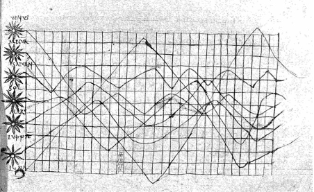
The line chart has been seen in history as far back as the 10th or 11th century, where an unknown author draws multiple lines on a grid to compare time-series data about the “classical planets” of Venus, Mercury, Saturn, Mars, Jupiter, the Sun, and the Moon.
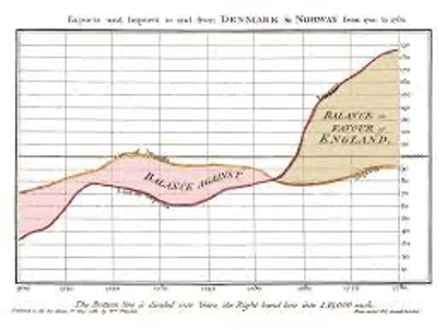
An early publication of the use of line charts was in 1785 when the Scottish engineer and political economist William Playfair included line charts in his published material "The Commercial and Political Atlas."
The widely used and recognised line chart remains a staple element in visualising and reporting data. Most people would have encountered charts and graphs during early school years and students will most likely have fallen into some form of a normal distribution curve. With line chart drawing functionality being found in software, business intelligence tools and programming libraries, it is all but ensured that Line charts will continue to retain it's "OG of charts" status.
The objective of this challenge is to use any data from any theme you like but to present your viewpoint or insight using one or many line charts.
Tableau is exceptional for producing line charts simply from its inbuilt ability to handle date fields in discrete and continuous fashion and the extensive available options for using dateparts / date components. Tableau also provides exceptional features to configure and decorate the line chart, allowing easy dual axis and mixed type charts with rich colour and text formatting. Tableau also provides a great set of statistical analytic features to overlay onto the charts and together with dashboard interactions allows for some fantastic visualisations, but also keep in mind that sometimes simplicity and clean minimalist designs also result in awesome dashboards. Again we encourage you to get creative and don't be afraid to get conceptual.
The only drawback of line charts is that they can sometimes be mis-applied to fit scenarios such using line charts over categorical axis, which can result in ambiguous trends that should not be implied, however there is no such thing as a bad chart if it successfully communicates the intended message.
The viz should be formatted for desktop consumption (suggested size 1600x900 px), and mobile/tablet formats are optional. There should be enough time to create an impactful viz, but as you are publishing to an audience, don't forget to apply best practice and polish your viz with appropriate tooltips and headers & footers etc where applicable. For professional courtesy don't forget to reference any sources of inspiration and data sources used.
For consideration in the September Viz Roundup, entries will be accepted up till 26th September. Shortly thereafter a review article will be released to summarise and highlight entries.
For your entries, be sure to:
- Publish on Tableau Public with hashtag #ProjectDataViz
- Share to Twitter with hashtag #ProjectDataViz
- Share to LinkedIn with hashtag #ProjectDataViz
- Submit your Viz to Project Data Viz
Good luck and we look forward to your awesome entries.